I’d seen Scott speak at AEA Seattle in 2011 and had been following him on Twitter for some time, when this tweet popped into my timeline:
Last call for web designers who want to work on a redesign of scottberkun-com http://t.co/UyXCchY64z #design #ux #webdev — Scott Berkun (@berkun) April 23, 2014
Working with someone with as much experience and expertise as Scott sounded great, and I was thrilled when he hired me for the redesign.
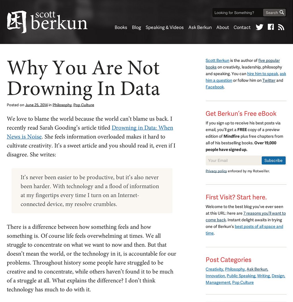
I reviewed his redesign goals, established some new ones, and got a general sense of the style he was looking for. With Scott’s design and management background, we decided to take a very iterative approach with lots of back and forth. Instead of spending days or weeks on a layout, I’d spend just hours before sending it to him.
Working closely together throughout the process, the entire information architecture was modified for easier content discovery. The design was updated to increase conversions where he needed them (email signups and book sales), while the WordPress backend was highly customized to provide him the ability to update all aspects of the site. With a focus on the content, Minion Pro was the chosen font, set in generous sizes for increased readability.
Check out Scott’s new site at ScottBerkun.com or my other design work at SevenBold.com
